Latest Posts

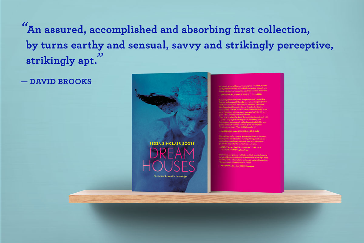
DREAM HOUSES poetry collection

With a foreword by acclaimed Australian poet Judith Beveridge, DREAM HOUSES is

šŸŒ± ā€œan assured, accomplished and absorbing first collection, by turns earthy and sensual, savvy and strikingly perceptive, strikingly apt.ā€

David Brooks

Anchored in bodily experience, the poems in this 65-page collection investigate memory, intimacy and belonging in a ā€œfresh and incisiveā€ way. Order now from Kelsay Books or Amazon Europe /Amazon US.


šŸŒæ ā€œThese poems seem expounded wholly from both body and spirit and often attain their power from the way beauty and menace play off against each other.ā€

Judith Beveridge

šŸƒ ā€œBeautifully constructed poems plunge us into wild coastal New Zealand landscapes filtered with green light, and large night skies.ā€

Janet Kenny

the flowering woman, or, Daphne in Te Aro

The Poetry Lightbox Series is curated by Wellington poet Sarah Scott at Thistle Hall and showcases fragments of poems, collage and erasure by writers responding to the natural environment in and around Wellington | Te Whanganui-a-Tara.

Sarah writes; By presenting written work in a visual form, it becomes both a visual and a textual experience. Both elements unsettle the text’s usual purpose, making it delightfully unclear whether the page is meant for reading, viewing, or something else. One of the inspirations behind the idea for this project is American poet Mary Ruefle’s erasure poetry, which she makes into works of art by painting out the words she doesn’t want to use with correcting fluid, leaving only beautiful, ethereal fragments. She says, ‘all the words rise up and they hover a quarter-inch above the page. It’s like a field, and they’re hovering. I don’t actually read the page. I read the words, which is different.’

Is it a poem or an image?

This magpie collecting of fragments is my typical visual process, Iā€™ll collect images that attract me, with no real intention. Only later in the process of sifting and sorting, will the true worth or meaning of an image be revealed. A sort of purposeful accident, but the point to me is to keep the eyes open to the world around us.

Studio Notes

This poem fragment, crossed with two image cuttings, is called the flowering woman, or, Daphne in Te Aro.

The first image is a colonial-era botanical sketch from the German Transport Museum in Berlin. This softly-lit watercolour of flowering pōhutakawa attracted my eye from across a darkened room crammed with model ships. The second image is a half-destroyed carved wooden statue of a woman, from the Hungarian National Museum in Budapest.

The poem fragment is a line from a poem called ā€œMary, Ascendingā€ about the passing away of one of my earliest mentors, Coromandel artist Mary Foreman.

I was lucky to know Mary as a teenager; she was my grandmotherā€™s great friend. Mary was primarily a printmaker ā€” she had a beautiful sinuous line in all her work, and to me she embodied the life of an artist. When Mary passed I was in Aotearoa and was lucky again to attend her funeral. After the service in her garden, I wandered down to the shady swimming hole in the back of her section where Iā€™d swum as a teenager and young adult. The rope swing for dive bombing the dark green water was still there. Thatā€™s when I had the idea for the poem, that essentially all the eels, fish, birds etc. on her property had been her subjects, and she was a kind of secret queen of the beasts. It sounds a little wacky, but it fitted my idea of Mary, as some kind of next-level being.

The poem in turn sits inside a sequence called Bodies of Water, which uses the Beaufort Scale as a structure to explore transformation.

In the flowering woman, putting two unrelated images together, transformed them, their proximity suggesting the mythic Daphneā€™s metamorphosis into a tree. Somehow, from my current location, in the middle of the German response to the pandemic, I found Daphneā€™s self-protective shape-shifting to be a highly-relatable response to ever-present and swiftly morphing danger. So, in that sense, this image is a record of a state of becoming. This is how the creative process feels to me. The title also refers to the kind of mental, and spiritual flowering, when you hit your mark as an artist of any kind.

Iā€™m so honoured that the flowering woman can be on this wall in Te Whanganui-a-Tara, especially whilst in covid-induced exile šŸ’™

Emily Dickinson & punctuation-reveal

I’ve long suspected I lean on em dashes too heavily in my poems. I blame Emily Dickinson. OK, that’s very weak. I blame myself and my love of Emily Dickinson’s em dashed line endings, for in Emily’s hands the em dash is sublimely enigmatic.

Witness, a few lines from one of her most well-known poems, Because I could not stop for Death (1863):

Because I could not stop for Deathā€”
He kindly stopped for meā€”
The Carriage held but just Ourselvesā€”
And Immortality.

After all those pauses and hesitant gaps, the final full stop is a killer. It hurts but I think I have to strafe my entire manuscript of gratuitous em dashes. Kill my darling little dashes. Create that oblique ending some other way. OK, I can deal with that. But what I’m still coming to terms with is my now revealed fondness for commas, as evidenced by the picture, below. My current manuscript run through Clive Thompson’s incredibly cool punctuation machine. No words. Commas galore. Quite a few question marks, a couple of lovely ampersands and a dollar sign. But very few parentheticals, so, on balance, not all bad…

I ran my current work in progress through this punctuation parsing tool, in a not at all procrastinaty way.

Alchemy: from poem to song

Setting of ā€œMother of Pearlā€ for voice, trombone and cello by Lisa Stick
I first met music educator and singer, Audrey Bashore, when she taught my son at the Kindermusik early years music studio in Hamburg.

A few years later, Audrey asked me if I’d be interested in collaborating with her and jazz composer Lisa Stick to turn one of my poems into a song. That’s how I came to be sitting in a comfy armchair listening to Audrey singing my poem, with Lisa on trombone and Ruben on cello. It was a live transformation of one art form into another and alchemy of the best kind.

Being a part of Audrey’s Art Song project was magical, so I was doubly thrilled when they agreed to perform settings of Mother of Pearl, and Sounds of the Sea at the launch of Dream Houses.

Is it worth doing a special launch edition?

The launch of your book is a big deal. Is it worth creating a limited edition for the launch? I hummed and hahed about this for ages, but in the end I decided to do it.

I had a few reasons: design compromises happened in the production phase and I never loved the way the book looked. Maybe that was mere vanity. One other reason was the realisation I wanted to somehow honour my heritage more than the cover design I ended up with did. Another reason I made a special edition was to acknowledge the people who were showing up for me at the launch. All good reasons. On the downside, the cost was a factor, but in the end, I decided the best solution was to offset print an A1 poster on soft grey uncoated stock and chop it up myself using a scalpel and metal ruler. I used an online print service and they did a really passable job : ) Next step was to dust off the cutting mat and channel Design School packaging 101 wisdom from back in the day (stroke the paper, don’t go hard). I got to slicing, creasing and folding. A tad nerve-wracking as I had just enough posters and couldn’t afford a single botch. In the end, it was a really cost-effective way to create something special for the launch. Just a bit of planning and a sore back from standing at the cutting table all day šŸ˜…

final result!

But I also want to talk about the image. The image and the accompanying diary are dated 1933. They come from a trip my grandfather Walter Scott and his brother Bobby made together in the Rakaia headwater region of Te Wai Pounamu. The brothers were keen trampers and mountaineers, regularly heading up above the snowline. The photographs and notes we still have in the family are an incredible record of the land as it was then.

Louper Pass, above Ramsay Glacier, Rakaia River headwaters, Te Wai Pounamu

The image comes from a time in history that I feel conflicted about glorifying. It reflects the experience of a small group of privileged Pākehā men, who were free to roam the supposedly ‘empty‘ land. It’s a set of circumstances that makes me inherently uncomfortable. However, although my grandfather was a product of his era, he had an abiding and deep love and respect for this land. So I decided to make peace with context, and choose a photograph of the Ramsay Glacier, taken from Louper Pass.

Comparison of Lyell Glacier in 1866 and in 2018. Images Credit: Julius Haast and A. Lorrey ā€“ NIWA

Somewhat sobering is a rough comparison with the same area today, showing how much creep back the glaciers have experienced in just a bit over 100 years šŸ˜¢

Dream Houses launch, Hamburg

We launched Dream Houses a year ago at the Lesesaal Bookshop and CafĆ© in the heart of Hamburg. Thank you again to all the people who came along. Also Stefanie, Wolf and Massimo for the beautiful space, to Audrey, Ruben and Lisa for the music, to Hugh for his reading, to Caitlin for the Mihi, Theo for just being, Geraldine for the aroha, AndrĆ©s for being my rock and to Carsten for the gorgeous photos šŸ“ø


DREAM HOUSES Launch at Lesesaal Bookshop & Cafe

DREAM HOUSES will be launched at the stunning Lesesaal Bookshop and CafƩ in the heart of Hamburg, on 25 October at 19:30. Come along and celebrate the occasion with me and my creative friends over drinks and snacks! In honour of the occasion a special edition of the book will be on sale.

LOCATION & PUBLIC TRANSPORT INFO
Lesesaal Bookshop & CafĆ© is located at StadthausbrĆ¼cke 6, 20355 HAMBURG.

Public Transport: Take the S1, S2, or S3 to StadthausbrĆ¼cke station or the U3 to Rƶdingsmarkt (5 minute stroll).


Goethe Institute Interview 2/2

This is a slightly truncated version of the interview I did with Romanian poet, Iowa alumnus, journalist and publisher Andra Rotaru about writerly attraction and literary crushes. Part one is all over this page here.


PART TWO

ANDRA ROTARU (AR): What are the literary and artistic tendencies that you are attracted to?

TSS: I think of poetry and art in general as a part of a continuum of image-making. Iā€™m also a visual artist and designer, I studied painting at Art School and worked for a long time as a graphic designer. Image making for me has to do with framing, perspective and scale.

Read More

Goethe Institute Interview 1/2

In 2017 it was my privilege to be an invited guest of the European Poetry Biennale at Transilvania University in the gorgeous Romanian city of Brasov. It was a truly game-changing experience for me; from being approached for an autograph by a shy young woman with dazzling blue eye shadow in the local kebab shop, to walking the foothills of the Carpathian mountains with hungover poets, not to mention being upgraded to first-class on the way home.

After the fact, I spoke to Romanian poet, Iowa alumnus, journalist and publisher Andra Rotaru about the experience and about my abiding interest in both slapstick humour and the darker notes expressed in the arts of all kinds.

PART ONE

ANDRA ROTARU (AR): You’ve been living in Hamburg for a long time. The first poetry volume, entitled “Dream Houses”, was published in the USA by Kelsay Books, in California. How difficult is to write, in general, in another language than the country you live in? What is lost, what is gained?


TSS: I deliberately write in English, despite having lived in Germany for over ten years and speaking the language pretty fluently, I still have a hard time with writing poetry. For me, German is first and foremost a pragmatic language that has to do with dealing with authorities and buying groceries, an everyday language. But my inner world is English, and to externalise this I use the appropriate means. For me, writing poetry in my native language is also about re-centering myself within a language which links me to an earlier life in New Zealand.

Read More

Paradise Diptych | Downloadable Poem with notes

The poem Paradise Diptych (download here) from my first poetry collection DREAM HOUSES was inspired by this mural by New Zealand artist Colin McCahon. Painted directly on the interior wall of the artistā€™s kitchen, circa 1952, it was acquired directly from McCahonā€™s French Bay home (now the McCahon House museum) by my father in the early 1960s.

As the painting formed the inside cladding of the McCahon familyā€™s kitchen wall it had to be literally cut out of the existing house. My Dad and his friend Frank, then architecture students at Auckland University, drove out to the lush, green west coast of Auckland one afternoon and removed the work in two pieces, lashing them securely on top of their car with ropes, then plugging up the space left by the wiring and light switch with a slap of brown paint, which you can see in the photo above. I don’t know if it was raining on the day they drove out to get the painting, but I like to imagine it was.

I grew up staring at this picture as we ate our dinners, and I always thought it was my Mum and Dad in their garden in Auckland, which was a kind of paradise for us four kids (the four little birds from the poem). The original painting still hangs over my parentsā€™ dining room table, a facsimile has been installed in the museum.

Lisa Stick Septett

Speaking of boxes… look what just popped out of its šŸ“¦

The first of 2 posters I designed for the luscious Lisa Stick Septett | See them at Birdland šŸ§ and all over jazzy Hamburg joints this summer šŸŒž

Thanks to the fabulous Audrey Bashore for the šŸ“· and to Lisa for being such a super sweet project partner šŸ¦‹

Daniel Matzenbacher’s favourite ice-cream* flavour?

A republish from the archives in memory of Daniel, a truly great illustrator, and ice-cream connoisseur, who passed away recently. He’s missed by everyone who knew him.

* You won’t find this nugget of information in the online interview I translated for Daniel back in 2016. What you will find is a chronicle of a restless, brilliant mind and a complex character riffing in an only slightly jaded, thoughtful, lucid rant about the whys & wherefors and also the craft of being a successful illustrator.

Over 25 years Daniel’s body of work has graced the pages of some of Germany’s most illustrious news media, so he’s in a position to pontificate. Think ‘Die Zeit’, ‘Stern’, ‘der Spiegel’ and you’re on the right track.

EXCERPT FROM MAGAZINE INTERVIEW

Q1: Daniel Matzenbacher, thanks so much for your time, weā€™re really excited to have you and your agency with us as guest ā€˜creative of the week.ā€™ Could you please tell us a bit about yourself and give us a potted history of your career and training?

A: Iā€™m one of those late-blooming autodidacts. I was born on the left bank of the lower Rhine and I always loved drawing, but in my youth I was way too flakey and unfocused to turn it into any sort of viable career option. At that time all I wanted to do was make music. When I turned 30 things really started to take off. After a couple of years freelancing as a graphic designer, I was picked up by the representation agency Becker/Derouet (formerly of Hamburg) who all of a sudden started chucking loads of work my way. Until the mid 1990s I did conventional illustrations for ad agencies and magazines. Even from the get go I worked for top-notch addresses; Stern, Spiegel, Zeit Magazine and such like. In 1995 I bought my first computer, just on a whim, to see what would happen. I very soon realised that the apple was the ultimate collage machine. Thatā€™s how I still use it today.

Q2: Whatā€™s the primary focus of Matzenbacher Illustration and what special services do you offer?

A: The central focus of my work is without a doubt the digital collage. I work with a, by now, vast back catalogue of found and self-made source imagery, including for example old advertising illustrations, photos, text snippets, old paper. Any old found objects. A completely soaked and filthy fragment of paper found in a gutter somewhere with the barely legible print ā€˜Controlā€™ is a real treasure! I quite often take my camera out and photograph anything and everything; structures, surfaces or physical spaces, I scan dead flies or mouldy bits of pizza. There are absolutely no limits in terms of my imagery. By the way, I often use my own hands for the hands of my figures. And of course I use online picture archives.

Apart from colour tweaking and the occasional filter, I pretty much never work with computer-generated imagery. Any 3D bits and pieces that pop up in my work are built, not rendered. My way of working is always intuitive, for the most part without a plan and lives or dies by allowing the space for coincidences to occur. Beyond the key ideas in the manuscript, itā€™s about the little details or a certain ambience that just happens or becomes evident through the process of the work – now thatā€™s really exciting! By the way, this principle pretty much applies to all other areas of my life!

*  Read the rest of the interview, filed under ‘trivia’ at http://www.matzenbacher.de/trivia.html?&L=1

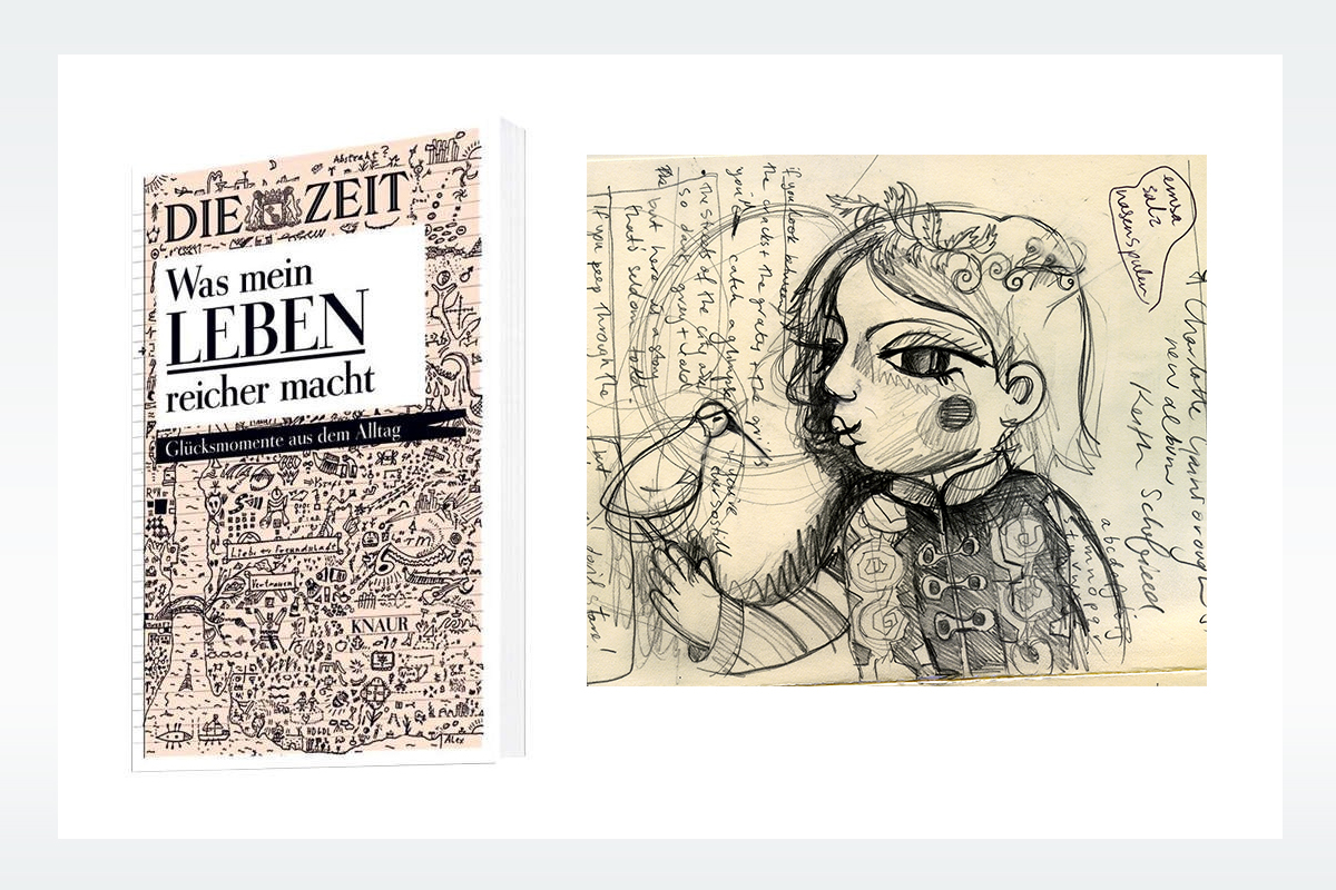
Was mein Leben reicher macht?

Someone, somewhere, once said that we become the books that we read. So, if we read happy books, we get happy, right? Well, now you can experiment on yourself with the nicely produced volume Was Mein Leben Reicher Macht from Knaur Verlag. These collected musings of Die Zeit reading Germans are now available in hardback form. Turn to Page 161 to see my contribution in visual form! Was Mein Leben Reicher Macht by Wolfgang Lechner is available from Amazon and directly from Knaur Verlag.